iPhone Programming 101, part Four: Designing your app
So now you know a little about the toolset and the language Objective-C. Trouble is, that is just the beginning. It is as if you have a hammer, a saw, the book “House Building for Dummies,” and maybe even an idea of what you want the final house to look like, while facing an empty lot. And as Robert Redford’s character said at the end of the film, The Candidate upon winning a hotly contested election: “Now what?”
Designing a major piece of software such as a billing system for an airline, or Kill All Humans-3D is a non-trivial thing to do. A large game can cost as much as a movie these days, require dozens of artists and engineers, and take years to complete if at all (See Duke Nukem-Forever). Thankfully the iPhone with a smaller screen and limited input has “lowered the bar” to entry when it comes to games or most any other kind of software. That’s not to say that iPhone apps are cheesy when compared to the PS3, but in the iPhone world, writing a compelling application might only take one or two guys and a kitchen table. This is not at all unlike the excitement that surrounded the early days of home computing software when someone could bang out a fun and profitable game or utility for the Apple II in only a couple of months.
The first thing to do is to figure out why you want to do an iPhone application in the first place. To become fabulously wealthy overnight is not the best reason, as most applications may generate only enough each week to buy a bag of M&Ms. A small bag. The runaway hits such as Ocarina are very few and far between. For every Angry Birds there are thousands of iBeer knockoffs.
But if you want to do an app just to learn programming, and to show off to a few friends, now we’re talking. Programming is a fascinating discipline particularly if you are a detailed-oriented type who can work alone. However, if you are the president of the local Toastmasters, maybe not.
Perhaps the best reason to do an app is for yourself: be it a game, utility or educational application, as long as it is something you need that isn’t addressed by any of the titles currently in the store. If it doesn’t sell, so what? You can still have the feeling of accomplishment from actually writing a useful program for yourself. And if it needs a new feature, you can sit down and add it yourself instead of waiting for some anonymous coder to do so. And if it is something you need, guess what? It could be useful to someone else, and who knows, you may just mak
e a little extra spending money on the side to cover the cost of an iPhone 5.
And let me tell you, it’s really great to check into your iTunes Connect account the day your application was approved and see the very first sale.
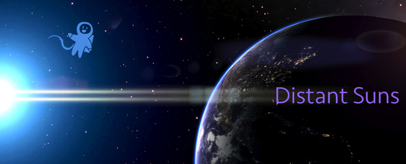
So let’s assume you have finally decided on what your app is supposed to do, and maybe even sketched out a few screens. Each programmer has his or her own style of working. Some will create detailed specification documents up front before the first line of code is written, others could dig in with only a vague idea of what the target might look like. I belong to the latter group. With Distant Suns, I knew I just wanted something to display the stars and planets, so started there. The interface was only secondary and would be driven by the display.
The look of your app is strongly dependent on what genre it is. If it is a utility for example, there is no need to get too fancy on the interface, so using the built in screens, toolbars, list-boxes, etc, should be fine. If you want to do something much more on the entertainment side of things, Apple recommends using a more creative interface. iPhone games in general tend to have fairly simple UI requirements interestingly enough, although the underlying code is likely to be some of the most complicated out there.
Examine the built-in apps on the device. They tend to be pretty no-frills, such as the mail client or iTunes. There is an exception when it comes to the calendar and contact applications however. Both use a book metaphor

by supplying some nice artwork to customize the otherwise standardized iOS widgets.
If you are looking at more of an entertainment application, the sky’s the limit. In this case, be prepared to hire an artist and spend a lot of time fussing about some of the tiniest details. One side effect of this is that if you do use your own custom widgets, it would make porting it over to other devices and environments much easier.
The basic design process can be divided up into two major categories: 1) The User Interface (or “UI”) and 2) all the other stuff.
The UI is typically both the most fun and confounding part of any application, and can be much more than merely having a button labeled “Do something cool!” Subtle details build upon subtle details ad-nauseum and can follow increasingly more convoluted pathways rivaling the health care bill in complexity.
In games, the UI is usually pretty straight forward, but in other applications such as astronomy software, it can be frustratingly opaque. And no matter how robust you think the UI is, someone is bound to find a way to crash it (usually someone who is about 7 years old.)
The first rule to follow when designing the UI is that of “the Law of Least Astonishment.” No matter what your application is likely to be, ensure that it will never have your users pause and mutter the immortal words, “what the…?” Make the job of achieving a specific task the most straightforward and obvious way. Too many programmers design the UI to follow the natural flow of the code, when normal people care nothing of the implementation; they just want to get the job done. For example, don’t have a shortcut such as ctrl-Q to mean “Yes I’ll buy that Sword-of-Dragon-Smiting!” when in all other packages, ctrl-Q means quit.
In an iPhone app, typically there will be an obvious hot-spot you can touch should you want more information on whatever is being presented. In theory, Distant Suns should be no different if a user would like to pick an object such as a planet or star to expose more details. I decided to go against the common model since the data density can be so high compared the to the finger density of the user. That is, the width of their finger might actually cover up and therefore “pick” a dozen stars with no real way to distinguish what the intended star was (The iPhone UI guide recommends buttons no smaller than 47×47, a lot of stars can fit into that size of square). The solution was to have the user double-tap on the screen that would bring up a cursor in the middle of the display. Dragging the desired object into the cursor would leave no ambiguity as to what the user wanted. This failed in two ways: 1) how would they know to double-tap the screen to bring up the feature in the first place (don’t assume they read the documentation), and 2) on iOS devices, double-tap usually means to zoom-in or out. The next version still had the double-tap, but gave them a floating cursor that would track with their finger. Its use becomes a little more obvious, but still leaves much to be desired. The real “fix” would be to do exactly as the user would expect: touching the screen would display data about an object. Since the results would still be ambiguous, I need to have design that offers up an intuitive way to either show the user the one-true-way of picking (as in “we tried it YOUR way, let’s try MY way the next time”), or add some additional visual means to help separate the desired object from the undesired ones. Apple solved a similar dilemma which cut/copy/paste operations presented, by adding a cute little magnifying glass widget to expose the spot covered by the pointing device (ie, “finger”).
Another rule suggests that is perfectly fine to follow in the footprints of the pros. So let’s see how Apple does things once again. Their design ethos is a simple one. True, their products really are that elegant, simple to use, and are frequently beautiful when compared to their competitors and so on, but what unifies those pieces into a consistent whole is their secret sauce of interface design: they do beautiful and fun transitions between states.
In the natural world, you’ll never see anything instantly appear and disappear. Why should you on a computer screen? On iOS notice the smoothly sliding windows, transparency changes, crossfades and the blooming effect when an app is launched. The transition of an app into the background seen in the new iOS4 multitasking model is particularly fascinating: the app’s screen quite literally seems to slide into the background and fades to black while the new app in turn, comes out of the shadows to fill up the screen. It is brilliant and makes something as trivial as swapping to another program a beautiful little moment of visual joy. In the past little tricks like this required endless reams of low-level custom code keeping us graphics guys fully employed. But fortunately for all of us, Apple chose to expose the very animation toolset that they used to create those kinds of effects.
And that is one reason why the iOS products are simply a total hoot to program.
Next stop: go forth and code!
